Screenprinting
I’m very lucky to be doing a year long printmaking course in the amazing Cork Printmakers - I was supposed to do this in 2020, but we all know what happened then, so I am only getting around to doing it now. It started at the start of February and we kicked off with a 6 week block of screen printing.
It took a while to get my head around the process but I feel like I’ve kinda got a grasp on it. It’s definitely something I would like to investigate and experiment with more in the future - I am specifically enjoying the link with photography and see it as a way to construct and build images.
Attempt no.1
I didn’t know what I was doing really and didn’t think about it much beyond investigating how a photograph would translate into a screenprint. I was working with this particular photograph on a completely different piece so I decided to use this and see how it would work as a screenprint. I was a bit overwhelmed with the colours as these are very different to the types of colour I’d usually use - very bright and opaque.


These are my first, not very successful attempts, you can see I struggled to get a clean print, and the image itself just isn’t very interesting. But it was a great learning experience and I realised that I would need to plan a print a bit better for the following week.


Attempt no.2
I had more of a plan for the next week and I kept the available colours in mind as I tried to plan a print set up. I put this together in Photoshop - I used a found photograph and layered up with a background colour and some paint splatter effects to bring some colour in.


The individual layers were printed in black & white and were prepared to expose onto them onto the screen for printing - from Left to right: Solid background layer, image of woman and children, paint splatters and the isolated group of people to be the final top layer.

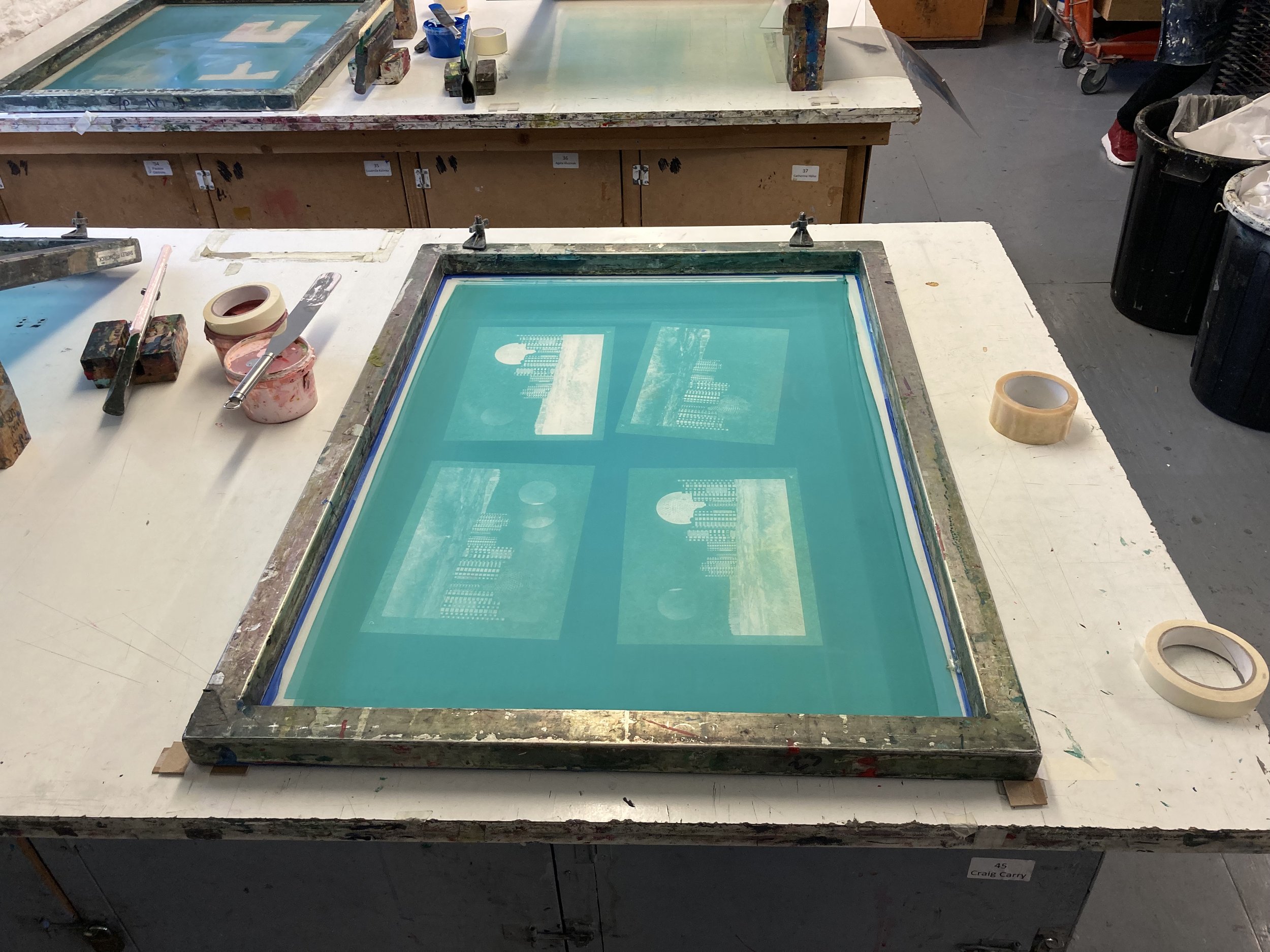
The exposed screen with each layer ready for printing
The results were mixed - my registration was off quite a bit when attempting to put the final layer on and I don’t think it worked well as a piece, but I felt it was a big improvement on the previous week and it was all starting to make a bit more sense in my head.


Attempt no.3 - CMYK
I was really excited about this process as it felt much more in tune with how my photographic printing brain works! I made up a collage of found and original images on my computer, keeping in mind that I wanted to have a wide range of colours to see how the printing process would translate from digital screen to screen print on paper.

This is the digital collage that I made up. The foreground image is one of mine, the image of the high rise buildings is one from Unsplash by Annie Spratt, the background image of the blue orbs is also from Unsplash and is by Evie S, the ‘disco ball’ is by Collins Lesulie and again is from Unsplash. The image of the row of house on the left is from Pond 5 - a great resource for vintage photographs in the public domain - I have lost many lovely hours lost in this particular rabbit hole.
The image has to be separated out into 4 different layers - Cyan, Magenta, Yellow and Black - and to be printed in that order
The results were really interesting. I loved the process and seeing how the image really changed with each layer of colour being added to it. My registration was much better this time as I had a solid line to line up each successive layer with (I still made several prints where registration was off, but I had more where the registration worked)


I did an offset version where you can see how vivid each individual colour is - I love that these super bright colours combined replicate the tones and colours of the original digital image.

The final print with the black layer added. The black layer really added depth to the whole image. I absolutely loved this process and am looking forward to doing some more of this with different images.